Those busy beavers at Blogger never rest! And, one is tempted to add, unfortunately.
 |
This week's change involves the batch controls, with special implications for managing labels.
So, first of all, the batch controls have been hidden behind a "manage" link (not shown) at right above the list of posts on your dashboard.
Operating on multiple posts
Previously these appeared in an orange bar across the top. They were activated by selecting multiple posts.
Now, though, the post-selection check box is behind the "manage" link.
This is another extra click, but not such a big deal. However, the control to filter posts by labels is now also removed.
Filtering is useful in managing labels and can also help to locate posts.
Managing labels
Update: Even better news. Blogger has added an old-style "filter by label" button next to the "manage" link. The search-field method, below, still works, but you no longer have to use it.
Bad news: You have to type "label:labelname" into the search
field at the top of your posts page. More typing!
Note to the hand surgeons of the world:
You can afford that yacht now.
Not sure how to reconcile the more-typing part with the blog-from-your
phone part. Maybe a fix is in the works for that.
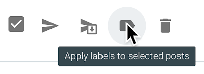
As before, "apply labels" also removes labels, if all the posts you have selected already have the label applied.
Mine is not to reason why. I hope this helps someone.
Update: This change originally made its debut in Blogger in Draft last February. It seems to have gone live in regular Blogger this week, so I have changed the publication date of this report accordingly and made minor revisions to reflect the current status.
Further update: There is now a "filter by label" button to the left of the "manage" control. This change is reflected in further edits to this report.
All of these changes are towards mobile usability and give no thought towards conventional desktop-based usability. (Think TAP instead of CLICK). It is awkward at the point-and-click level.
ReplyDeletejusTodd, I may be guilty of spreading confusion here, as the change does not seem to be pushed out everyplace.
DeleteThis is actually less usable for mobile. But maybe it's a false alarm—let's hope so!
I think I prefer the 'manage' link to do batch controls. I like having a box next to the posts to select the post rather than clicking on corners. I do maybe think the manage button seems a bit unnecessary.
ReplyDeleteI can filter posts by labels just fine by using the 'filter by label' button beside the 'manage' button. Are you referring to filtering labels when you're under 'manage'?
I don't know what's going on your side but maybe it's a glitch.
Have a lovely day.
Lissa, the "filter by label" button is a new refinement. I am only seeing it today for the first time. I agree it is a great improvement!
Delete